Alerts / Notifications
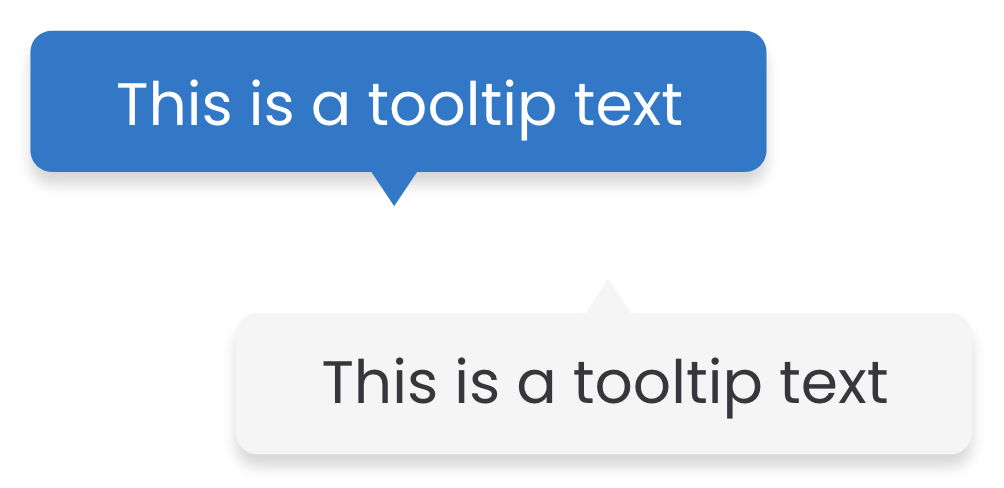
An Alert (or also called Notification) is a message
shown on top of the screen (for Desktop) and at bottom of the screen (for
Mobile devices). It covers part of the previous elements of the screen to
grab user's attention on a non-disruptive way. It may contain a combination
of text, links and a closing button.
Use Cases
- When the application is giving feedback on a user's action.
- When the application is communicating system actions to the user.
You have a detailed, full state standard notification type
You have a detailed, full state positive notification here
You have a detailed, full state alert type to interact with
You have a detailed, full state negative notification here
You have a detailed, full state standard notification type
07/12/2022
12:30PM
You have a detailed, full state positive notification here
07/12/2022
12:30PM
You have a detailed, full state alert type to interact with
07/12/2022
12:30PM
You have a detailed, full state negative notification here
07/12/2022
12:30PM
This text is longer than the maximum width of 470px, so it wraps, breaking into as many lines as necessary to fit the whole message into one notification
This text is longer than the maximum width of 470px, so it wraps, breaking into as many lines as necessary to fit the whole message into one notification
This text is longer than the maximum width of 470px, so it wraps, breaking into as many lines as necessary to fit the whole message into one notification
This text is longer than the maximum width of 470px, so it wraps, breaking into as many lines as necessary to fit the whole message into one notification
HTML
How to use the alerts
- The alert container must have the property role="alert"
- The button that dismiss the alert must have the property data-bs-dismiss="alert"
Do's & Dont's
Focus on what your user needs to know
Alerts / Notifications are one of the most used ways to inform the
user what's happening on the application.
When creating a message for this purpose, always consider the best way to talk to the user.
When creating a message for this purpose, always consider the best way to talk to the user.
Use the colors according to each case
As seen above, Alerts / Notifications can have different types of
messages. We have defined a 4 color-code to help the user identify
this easily.
When using these components, define the type of message that needs to be communicated and use the corresponding color.
When using these components, define the type of message that needs to be communicated and use the corresponding color.
On alerts, interactions are restricted
The information given by an Alert to the user is very specific and
narrowed on a particular task or action.
As this is quite narrowed, there is no need to use interactions on this component besides closing it. If further interaction is needed on the message you need to inform, please consider other alternatives.
As this is quite narrowed, there is no need to use interactions on this component besides closing it. If further interaction is needed on the message you need to inform, please consider other alternatives.
Alternative and Related components